VELA SAIL
WEBSITE
Problem
Many experience and activity booking platforms overwhelm users with dense information, inconsistent visuals, and unclear booking flows. This often breaks immersion and creates hesitation before conversion.
Vela Sail needed an interface that felt calm, trustworthy, and aspirational, while still guiding users smoothly toward action.
The Goal
- Present sailing experiences in a visually engaging way
- Simplify exploration and decision-making
- Maintain a premium, lifestyle-oriented aesthetic
- Design a scalable UI system for future offerings
Design Principles
- Visual storytelling first
- Clarity without clutter
- Guided discovery
- Effortless progression toward booking
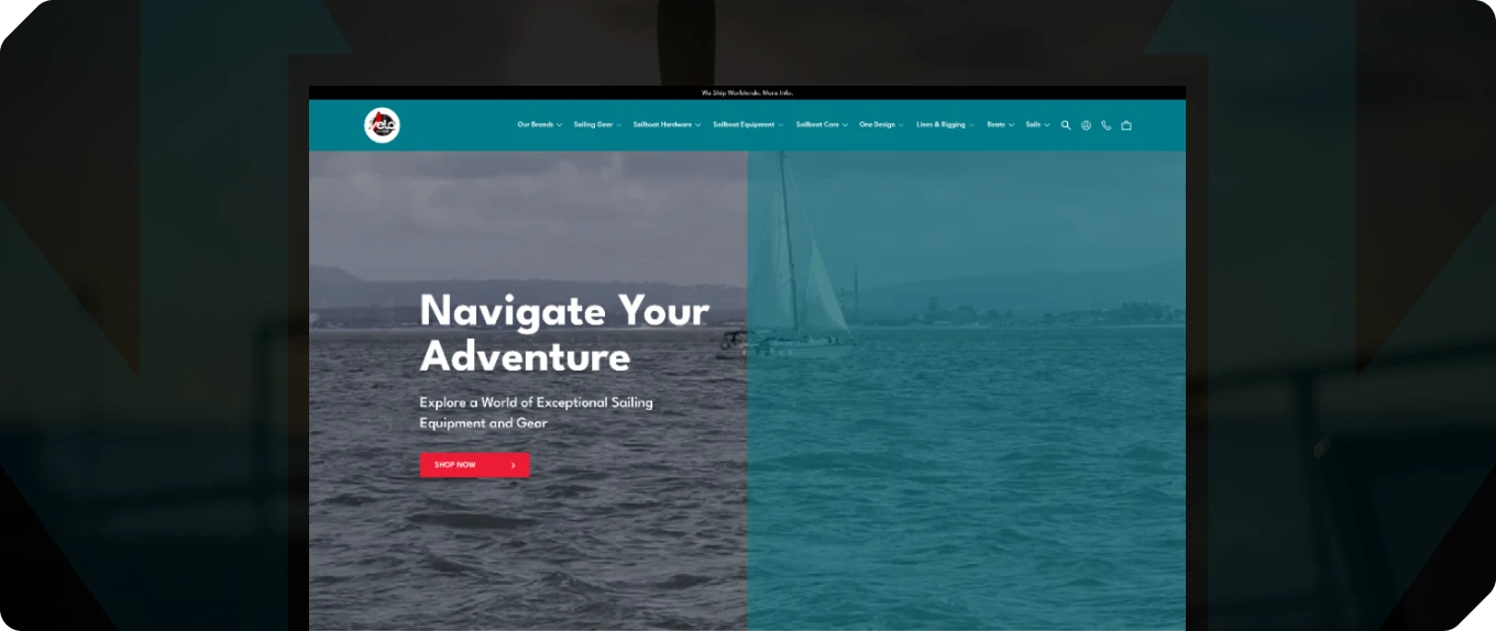
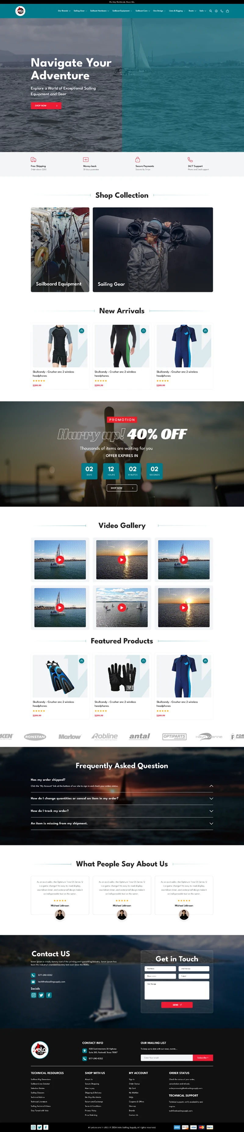
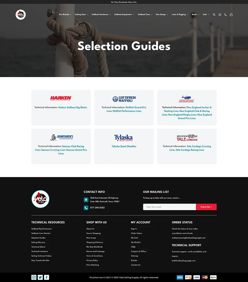
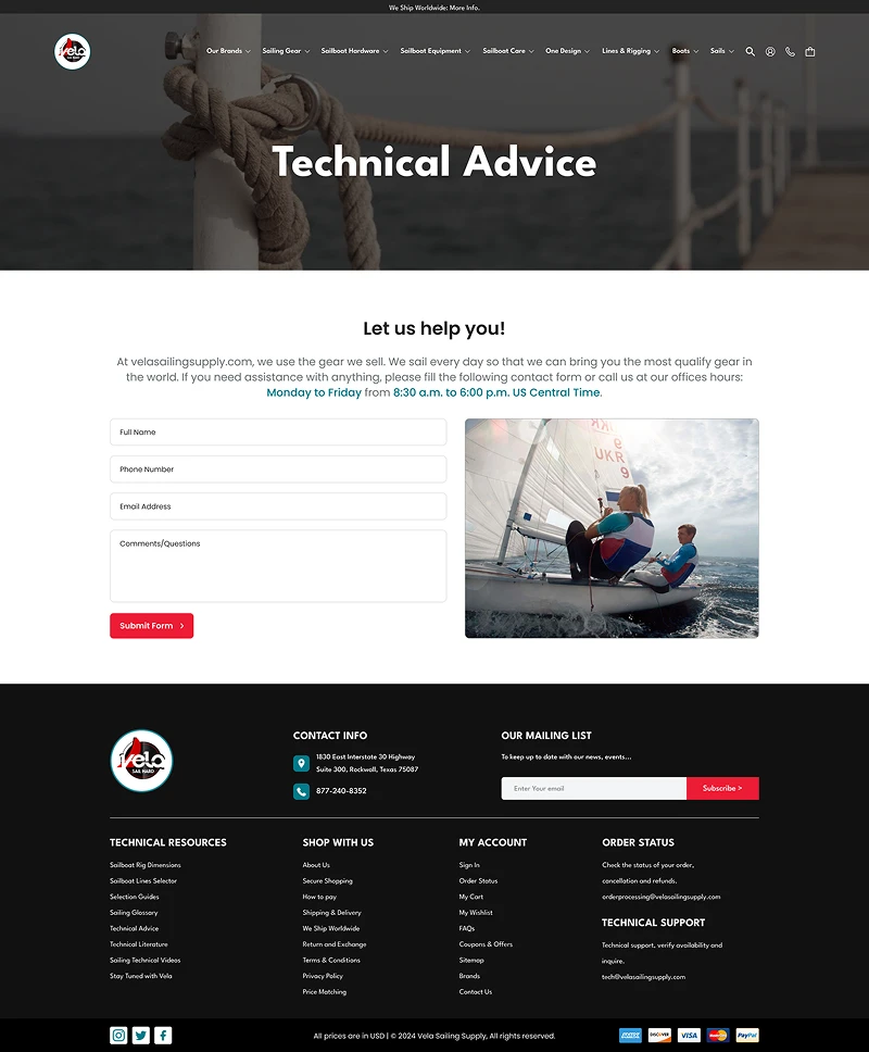
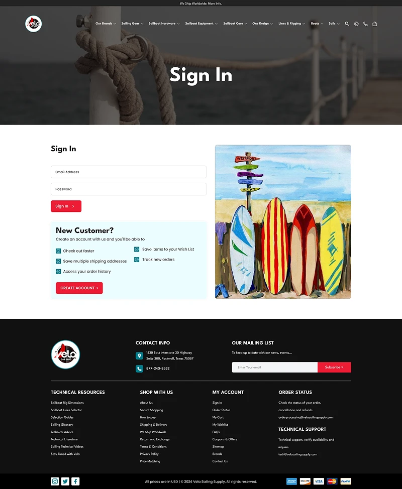
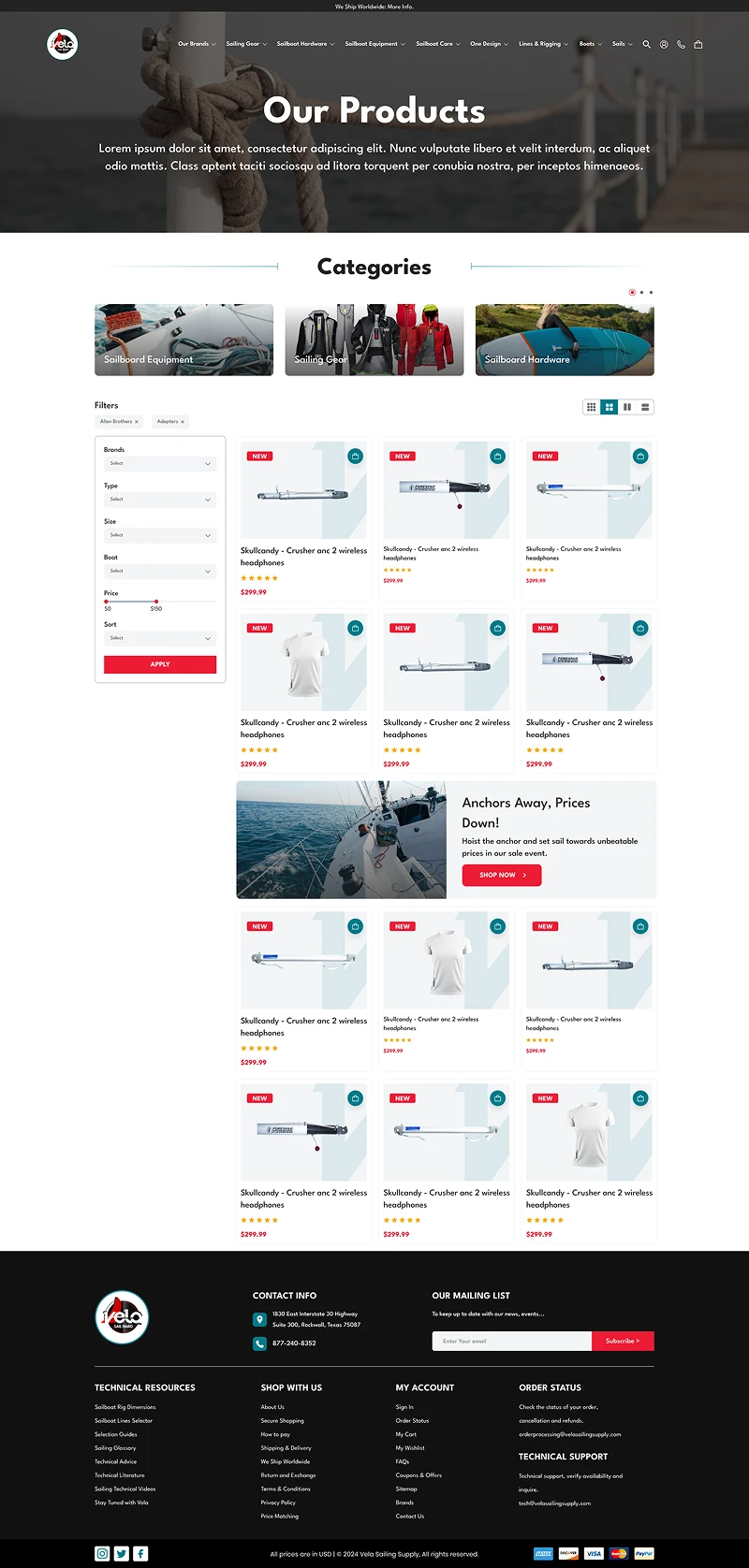
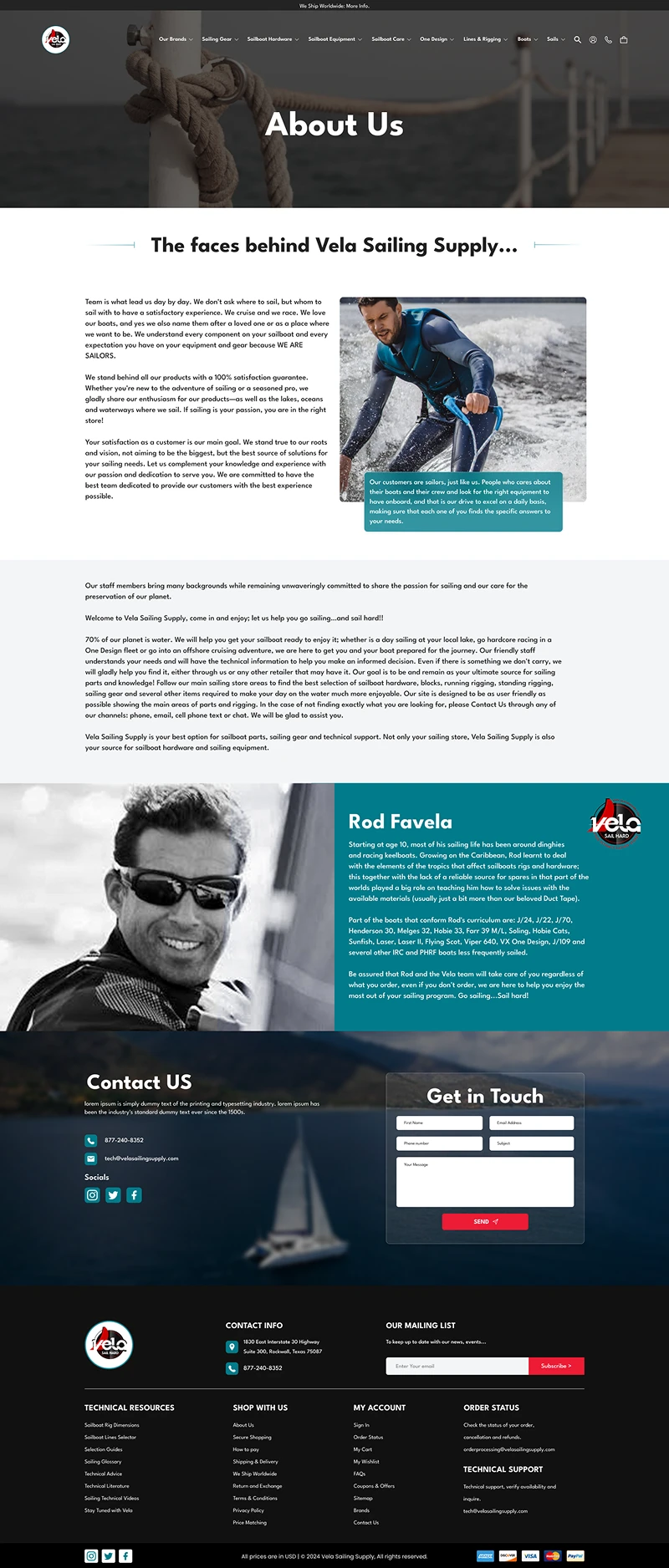
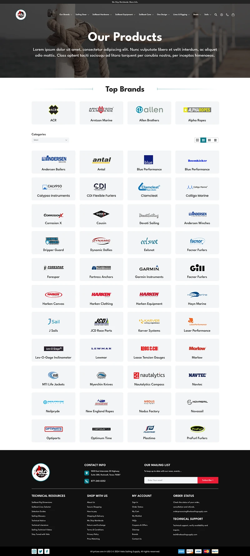
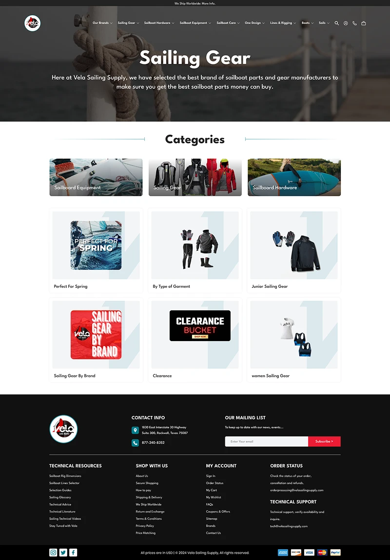
UX & Interface Design
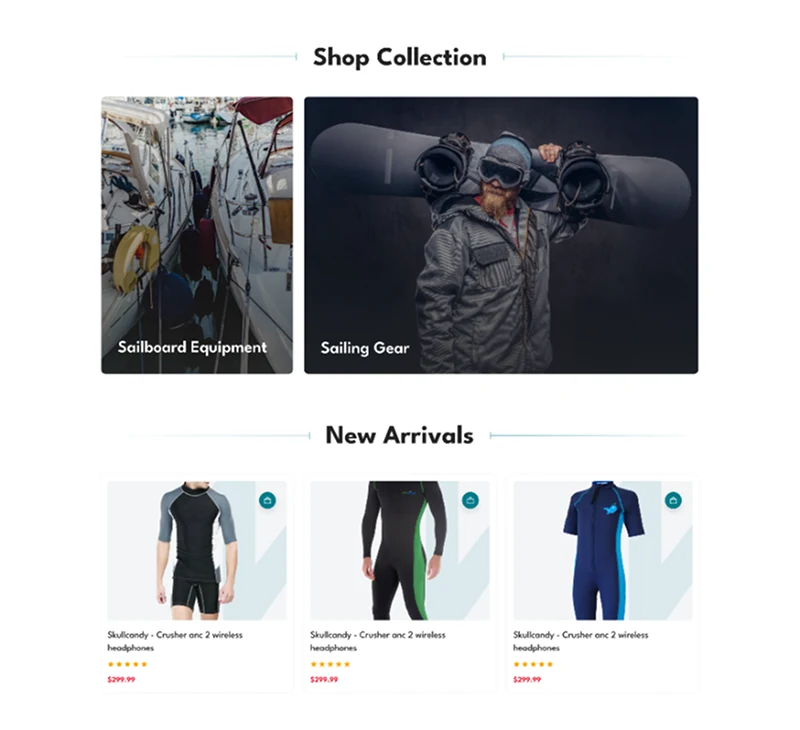
The experience uses a clean layout with strong imagery, allowing users to quickly understand what’s offered while staying emotionally engaged.
- Visual storytelling first
- Clarity without clutter
- Guided discovery
- Effortless progression toward booking
The UI feels premium without becoming heavy or complex.
Challenges & Solutions
Maintaining focus while using rich visuals
The layout prioritizes hierarchy and spacing to prevent visual overload.
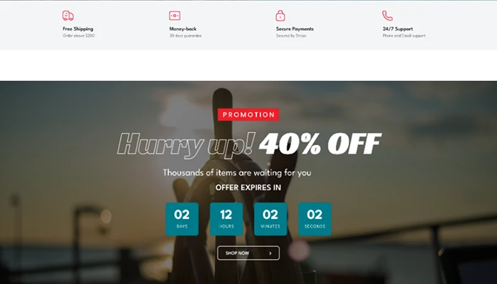
Encouraging action without pressure
CTAs are placed naturally within the flow, guiding users without interrupting the experience.
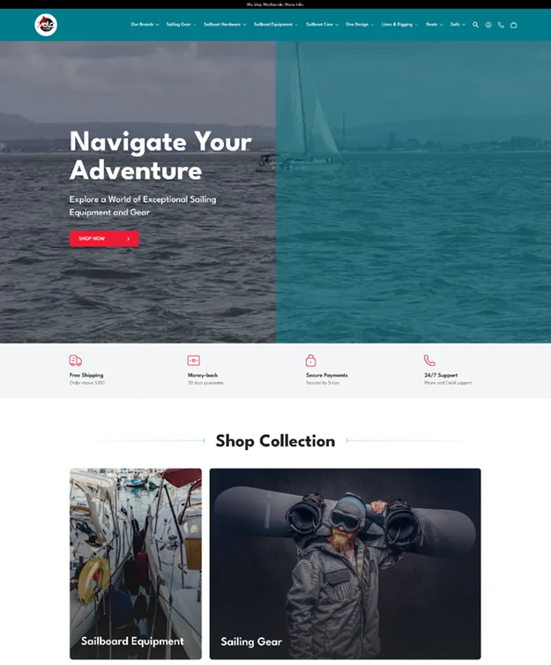
WEBSITE UI
Outcome
The final design delivers a calm, immersive browsing experience that allows users to explore content without distraction. It creates clear pathways from discovery to action, guiding users smoothly toward meaningful engagement. At the same time, it establishes a scalable foundation for additional destinations or services, supporting future growth and expansion.
Vela Sail reflects my approach to UX/UI design for lifestyle and experience-driven products, blending visual storytelling with usability to create interfaces that feel both inspiring and intuitive.